
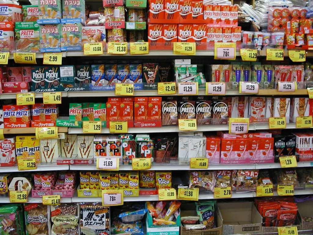
Japanese packaging is often criticized for using too many layers, but that criticism only tells part of the story. In Japan, packaging is expected to protect freshness, stay easy to carry, open cleanly and separate neatly for disposal after use.
That is why so many everyday products look more elaborate than their counterparts abroad. What seems excessive at first often has a practical reason behind it: smaller portions, resealable openings, tactile marks for accessibility or materials designed to be sorted more easily at home.
Contents 4
Why so many Japanese packages feel more practical
One of the clearest examples is the way snacks are portioned. A large outer bag often contains several smaller packs inside, especially for cookies, crackers, chocolates and souvenir sweets. This keeps the food crisp for longer, makes it easier to share and helps people carry a smaller amount without exposing everything at once.
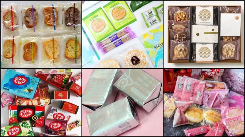
This logic appears across daily shopping in Japan. In busy households, on commuter trains and inside convenience stores, packaging is expected to work well in small spaces and fast routines. The same practical mindset also appears in prepared meals sold in Japanese convenience stores, where portability and cleanliness matter almost as much as the food itself.
Even small details show this concern. Tear lines are usually clear, trays are shaped to avoid spills and many products are designed so the consumer does not need scissors, extra clips or improvised storage after opening.
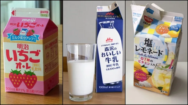
Paper cartons designed for opening and recycling
Japanese drink cartons are another good example. Milk, juice, flavored milk and soy beverages often come in paper packs with clear opening guides, firm folds and shapes that are easier to flatten after use. Some use caps, while others rely on carefully engineered folds that open without tearing the whole top apart.
This attention to disposal is not accidental. Japan has long treated containers and packaging as an important part of household waste policy, and consumers are used to separating materials carefully. That is one reason why packaging often includes visual cues that make sorting and cleaning easier instead of leaving the consumer to guess.
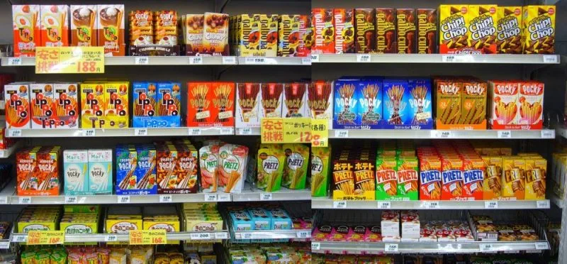
The same idea appears in PET bottles. Some brands now use labels that peel off more easily, while others have moved to label-free bottles sold in multipacks, reducing the amount of resin used and making disposal simpler for the buyer.
The milk-carton notch is a small but smart accessibility feature
One of the best-known details is the small arc-shaped notch found on many pure milk cartons in Japan. It is not decorative. The notch exists so visually impaired consumers can identify plain milk by touch and distinguish it from similar cartons containing coffee milk, flavored milk or other drinks.
According to Japanese explanations of the system, the mark was adopted after surveys showed that many visually impaired consumers had trouble telling milk apart from other beverages stored in similar packages. The notch is placed on the side opposite the opening, which also helps users orient the carton correctly before pouring.
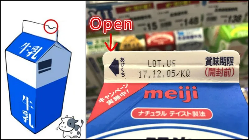
It is a small adjustment, but it reflects a broader habit in Japan: packaging is often treated as part of the user experience, not just as a disposable shell. The goal is not only to protect the product, but also to reduce friction for the person handling it.
Practical does not mean perfect
Of course, Japanese packaging is not free from criticism. The same features that improve hygiene, portability and freshness can also create more waste, especially when products are divided into many small portions. That tension is real, and it explains why recent packaging trends in Japan increasingly combine convenience with easier recycling and lighter materials.
Examples include label-free bottles, recycled trays in major retail groups and transport boxes redesigned to open faster without extra plastic tape. If you want to understand the disposal side better, it also helps to read how waste separation and recycling work in Japan, since packaging choices make much more sense within that routine.
So yes, Japanese packaging can look excessive. But in many cases it is also thoughtful. Freshness, portion control, accessibility, safer transport and simpler sorting are all built into the design, which is exactly why so many people in Japan see the package as part of the product itself.




Community
Comments
0 comments
There are no published comments in this language yet.
Send comment