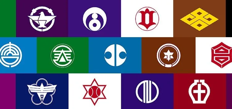
Japan is divided into 47 provinces or prefectures, each composed of cities, towns, and villages. Interestingly, all these provinces have their own flags, reflecting cultural, historical, or natural elements of the area. Just like the Japanese national flag, the flags of the provinces are marked by simplicity and symbolism.
Each of them combines colors, shapes, and stylized symbols — such as kanjis (ideograms), hiraganas, and katakanas — that carry unique meanings. Let's explore the design of some of these fascinating flags and what they represent.
Contents 6
Simple Design and Deep Meaning
The flags of the Japanese provinces follow a minimalist pattern, generally featuring:
- Solid background colors: Often associated with the identity of the province.
- Stylized symbols: Based on elements like letters of the Japanese alphabet, natural shapes, or historical references.
These elements are carefully chosen to reflect cultural aspects, such as nature, geography, and history of each region.

Flags with Hiragana
Some flags use stylized hiraganas, which gives a unique and representative touch to their provinces:
- Aichi: Features the three hiraganas of its name (あいち) in a stylized form, symbolizing harmony and unity.
- Fukuoka and Fukushima: The first hiragana of their names is transformed into symbols that capture the identity of the region.
- Kōchi: Its flag features the hiragana とさ (Tosa), the ancient name of the province, connecting past and present.
Flags with Katakana
Other provinces opt for katakanas, another Japanese writing system, to create modern and distinct symbols:
- Hiroshima and Akita: Use the first katakana of their names as the basis for the design.
- Chiba and Fukui: Stylize the full name in katakana, highlighting the unique identity of the province.
- Shimane: Uses the katakana マ (ma) four times, forming a visually interesting design.
Kanji on the Flags
Some provinces use stylized kanjis, representing specific aspects of their history or geography:
- Kyoto and Okayama: Choose to use only the first kanji, representing their essence in a simplified form.
- Tochigi: The flag combines the kanjis 栃 (Tochi) and 木 (Gi), reflecting the full name of the province.
- Yamaguchi and Ishikawa: Incorporate their stylized kanjis into minimalist designs, highlighting important local elements.
Natural and Historical Symbols
Other flags represent specific natural or historical elements of the region:
- Yamagata: Features three stylized mountains, symbolizing the local geography, as well as the Mogami River, which flows through the province. The blue of the flag represents peace, while the white symbolizes snow and purity.
- Tokyo: Displays a sun symbol, representing development, on a traditional purple background. Tokyo also has a second symbol, a green ginkgo leaf, which forms the letter "T".
- Shizuoka: Uses a stylized Mount Fuji, highlighting the iconic landscape of the province.
- Osaka: Represents a gourd, the symbol of Toyotomi Hideyoshi, and circles that form the letter “S”.
These elements reinforce the bond between the provinces and their unique geographical and historical characteristics.

Symbolism and Modernity
In addition to their simple forms, some flags have more abstract meanings:
- Saitama: Sixteen magatamas (ornamental spheres) form a circle representing the sun, development, and strength.
- Aichi: The minimalist design reflects harmony, a characteristic of the province.
- Tokyo: The use of purple connects to the ancient Edo, while the ginkgo leaf represents modernity and prosperity.


Community
Comments
0 comments
There are no published comments in this language yet.
Send comment